In my World History class I did a lesson today which I really liked and will review below. After finding the activity on GapMinder , I shared it with my class and we all liked for a lot of reasons:
- It helped broaden my students' view of the world.
- It was interactive and fostered communication and community.
- It told a very hopeful story, which is nice to hear in this age of uncertainty.
- It generated a great conversation about how to display data in an interesting, informative and visual way. There are a lot of tools that help with this. This image of Napoleon's retreat is probably the most famous data visualization of which I know.
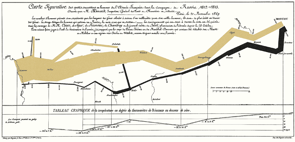
This gets me to thinking about the synergy we could and should create between the humanities, the digital humanities, the sciences and the arts. The main media for communication these days are not text alone. We need to be better (myself included) about teaching kids how to highlight their findings via a visual medium.
If you are looking for a rock-solid, one-off lesson or a solid supplement to a broader lesson, I strongly recommend this lesson from Gapminder.


No comments:
Post a Comment